

The future of image optimisation for SEO

Image optimisation can be confusing, with mixed signals sent out by Google and hoards of SEO experts. Just when you’ve finished making your images responsive and your content "lazy loaded," Google comes out with a Core Web Vitals metric that gives you a “Fail” when they push your content around the page. Even if you fix that issue, Google complains in their PageSpeed reports that you’re not saving your images as WebP.
What the heck is WebP?!
Cumulative layout shifts for images
For more than a decade, we’ve been telling web developers not to set a fixed width and height on images. If you set an image to 800 x 600 pixels in your HTML, and an iPhone 8 user views the page with a 750 x 1,334 pixel screen resolution, they’ll get a very annoying horizontal scrollbar and have 50 pixels of the image cut off. It’s not mobile friendly and we’re told to optimise for smartphone users. So instead, we make the image resizable based on the viewport width (e.g. width: 100%; height: auto;), using CSS.
The problem with this, is that most images do not load instantly on the page. The HTML and text content load first, then the images are downloaded and resized based on your CSS styling. And without specific dimensions set on the <img> tag, the browser has no idea how big the image will be, until it’s downloaded. No space is reserved on the web page layout, until the image is available to show. This isn’t a problem for desktop users with fast internet connections, but can cause frustration for visitors on slow connections, with buttons, content and links moving before you can click them or scroll.
Core Web Vitals (yes, May 2021) therefore includes a metric called Cumulative Layout Shift, which scores pages poorly if images and other elements make unexpected changes to the page layout after loading. So how do we fix it, without losing the responsive image resizing?
Aspect ratio
Google Chrome and Microsoft Edge (plus Firefox & Safari soon) have one solution to this problem, with the “aspect-ratio” CSS property. In most situations, images are set to fill 100% of the container/page width and then “auto” set the height. So a 1,500 x 1,000 pixel image would scale proportionally to 750 x 500 on an older model iPhone. The CSS and browser only know that the image will be 500 pixels high though, once the image loads.
Aspect Ratio fixes this, by allowing you to set the image proportions before it loads. In our case, the image aspect ratio is 3/2 (a simple fraction of 1,500/1,000). By setting “aspect-ratio: 3/2;” on the image’s CSS class, the browser will know the image height will be 500 pixels once loaded and can reserve the necessary space. This prevents any layout shift.
Content visibility
Unless your website runs on a slow JavaScript framework such as React or Angular, your biggest speed issue is likely to be large and/or plentiful images. Not only does each image need to be downloaded, but the file must be rendered and laid out on the page.
The old way of tackling this was using JavaScript, to only load the images when the user scrolls them into view (lazy loading). This relies on JavaScript and still has “overhead” for the web browser. As we discussed in our Core Web Vitals in Ecommerce article, Chrome and other browsers are now supporting native lazy loading. But by delaying the loading of images until they’re needed, we’re also delaying the inevitable cumulative layout shift, as browsers still don’t know the dimensions of our images until loaded.
Cue the new “content-visibility” CSS property, which is available in Chrome, Opera and Edge (Firefox and Safari soon). This property can be applied to entire sections of a page and delay the rendering of those sections until they’re scrolled into view. Unlike lazy loading, the image assets are still downloaded at the start of the page load. Visitors can start reading the visible content very quickly and download the assets for elements further down the page, in the background. This reduces the chances of CLS issues, as the browser should already have downloaded the assets by the time images are scrolled into view.
This isn’t a direct replacement for native lazy loading, however. Loading all of the media assets for a big page, may not be desirable for mobile users on slow connections. Large images and videos should still use native lazy loading to reduce bandwidth consumption, but always in tandem with the “aspect-ratio” CSS property mentioned above. You can also use “content-visibility” and lazy loading together, again on the condition of using “aspect-ratio” on images and other media assets.
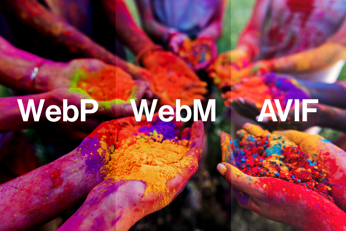
WebP, WebM and AVIF
If you’ve done a lot of Core Web Vitals optimisation, one of the few issues that a PageSpeed/Lighthouse report might highlight near the end, is using modern image formats such as WebP.
What are the new image formats?
WebP is an image format developed by Google for the web, designed to replace PNG, GIF and JPEG images. It is designed to have better compression than older formats and therefore smaller file sizes. With having support for transparency, it can be used to replace PNG file-types as well as JPEG whilst having a smaller file size than both generally even with transparency present.
WebM is the video equivalent of WebP, originally developed by a working group and then taken over by Google. As with WebP, it boasts better compression for the web and small file sizes.
AVIF / AV1 is another new image format developed by the Alliance for Open Media, which some claim is better than WebP. AVIF has already shown to have a better compression technology creating smaller files than WebP with the same level of compression/loss, however, as of now, only the Chrome web browser supports these out of the box without other setting having to be tweaked.
All three media formats suffer from poor developer adoption and browser support though. Naturally, Google has supported their own WebP and WebM formats in Chrome for some time. But other vendors, have only recently introduced support. As of now all latest versions of web browser support WebP with a caveat being that Safari on MacOS only supports WebP on Big Sur or later.
Web designers and developers are also reluctant to adopt the new format. They’re waiting for their clients/bosses to understand what the formats are about. Right now, the image formats cause friction. Have you ever downloaded a company logo from Google Images, only to find that they’re “.webp” and don’t work properly in your presentation or image editor?
Companies such as Cloudflare are helping with the transition, by automatically converting images to AVIF or WebP on behalf of their clients, if the user’s browser supports the format. However if you are not using CloudFlare and/or have direct control of the web server, Apache and Nginx both support methods of detection for browser support that can be used to dynamically serve WebP (if the file exists) even if the browser is requesting a JPEG or PNG.
The dirty little secret that PageSpeed reports don’t tell you, however, is that sometimes a well-optimised JPEG or PNG image can be just as fast and small as its WebP counterpart.
Cloudflare knows this, so won’t convert well-optimised and 100% compatible JPEG and PNG files. This causes no end of confusion to users, who activate WebP conversion and still get errors in their PageSpeed report.
So, therefore, we find ourselves held at gunpoint by Google once more. Do you convert all of your media to WebP, WebM and AVIF formats, but lose visitors on older browsers. Or ignore Google’s warning and hope that it doesn’t hurt your PageSpeed and eventually SEO rankings?
If you have a keen tech team and want to turn that PageSpeed warning green, you could create alternative images in WebP format yourself and then detect WebP support using the webserver directly as previously mentioned.
Alternative images (srcset)
As recommended in our Core Web Vitals for Ecommerce article, “srcset” is a very useful HTML attribute to add to your <img> tags. It gives browsers the option to download the best image for their resolution/viewport. This addresses the problem that large images on pages are just a waste of time and bandwidth from mobile users, whose screens are the size of the user’s hand. So mobile users could download a 600 x 400 pixel heavily compressed version of an image instead, specified in the “srcset” attribute. This still allows you to show the high res image in all its glory, to your desktop users on their fancy 4K monitors. Unless all of your images are already tiny and low resolution, this is definitely something that you’ll want to implement for users, search engines and Core Web Vitals.
Image tag optimisation - best practice
You probably thought that this article would just be about sticking “alt” attributes on images, stuffed with all your keywords. It has been covered by thousands of other SEO articles in the past, but there’s no point looking into the future if we don’t first look back at our past. So here’s a quick confirmation that nothing (hopefully) has changed in your mind about image tag optimisation:
The “alt” attribute
This attribute should be included on every <img> tag on your website. Its job is to describe the image, for screen readers (used by the blind), search engines and also if the image fails to load for some reason e.g. your CDN has downtime.
The contents of the “alt” attribute should be a short sentence, describing the image. Not a keyword list and not simply the search term that you want a page to rank for. Remember that Google has the tech to guess what is in images now, so describing a telephone icon as “best plumbers in London” probably isn’t the wisest idea. Alt attributes have a very small on-page ranking influence, especially for image search, so it doesn’t hurt to include your primary keyword when it’s relevant to the image content.
The “title” attribute
Most people leave this off or just duplicate the contents of the “alt” attribute. The big difference is that the “title” contents is shown when you hover over the image, rather than if the image cannot be seen or loaded. This can be useful for describing Hero images further, but sometimes ugly if the image is solely on the page to add to the aesthetics e.g. “blue to green gradient”.
The URL slug/filename
Likely to be a minor on-page ranking signal, but not one to spend time fixing. Having a descriptive filename (e.g. wrangler-black-denim-jeans-001.jpg vs. SKU-100321324.jpg) is just common sense and better for usability if anything. Again, there’s no point in keyword stuffing an image filename, as Google will see through it and it won’t help anyhow. But logical descriptive file naming is likely to help with Image Search rankings and Google’s indexing (knowing what’s in the image).
If you’re starting a new site or re-platforming, definitely build in and encourage logical file naming (as well as requiring an alt attribute). But don’t go to the trouble of renaming every image on an existing site, as the benefit will be minimal.
Image search optimisation
Google Image Search can be a very useful and profitable traffic source if you’re targeting certain sectors. Fashion sites tend to receive a sizable amount of valuable traffic from Image Search, as it's a very visual buying experience. Funeral Directors, Lawyers and Accountants, far less so.
There is no secret sauce to ranking well in Image Search. In fact, it’s mostly related to how authoritative and relevant the primary page hosting the image is. You can however outrank the top-ranking Web Search pages in Google Images if they haven’t followed the best practice advice given above. The main factors are:
Is the content around the image relevant?
Is the alt text relevant and not keyword-stuffed?
Do the links pointing to the page hosting the image, confirm that the page and image are highly relevant and important for the given keyword?
It does of course help if authoritative third party websites are linking directly to your images, but it’s rare to find natural cases of this happening, outside of viral memes and bloopers. Most websites hotlinking to your images are likely to be scraper sites, affiliates and comparison engines, with very little SEO value to pass onto you.
To summarise this article:
Use the latest techniques at your disposal, to help images load as fast as possible, across all devices and internet connections.
Make sure that the browser knows the image dimensions before the image is loaded.
Follow best practice, by implementing “alt” attributes, descriptive filenames and “title” attributes where appropriate.
If people buy your product or service based partly on how it looks, take Image Search seriously and tweak your images accordingly.
Sign-up to Reddico News
To keep up-to-date with the latest developments in the world of SEO, our insights, industry case studies and company news, sign-up here.


